What steps have you completed thus far?
The step that I completed was all of my blog entry and brainstorming how my project is going to look. I also found some pictures,graphics and cartoons that I might use in my project.
In what ways could your work be improved?
One way my work can be improve is by finding more cartoon as well as trying to come up with better saying inside of my card because to me it doesn't relate to the consumer and its not very creative.
The grade I would give myself for criteria F is a 4 or 5 out of 6 because I did all of my blog but somewhat I didn't get what the blog was asking me to do and I try to be creative with my saying, my consumer and my pictures. I have a positive attitude in technology by not disturbing the class.
Friday, December 17, 2010
Blog Entry#2.10-Target Consumer (B)
Target Consumer #1 is for little kids in which they have a lot of dream and hope for Victoria day. They are also excited to play in the amusement park.
Target Consumer #2 is for teens who want a happy Victoria day and want to hang out with friends. They also wish their friends and family to have a Happy Victoria Day even if their friends and family are not with them.
Target Consumer #3 is for sport because the person who play sport is wishing their friends to have a Happy Victoria Day in Canada and to wish them luck in their next game.
Blog Entry#2.9-Text Brainstrom (B)
- Food, entertainment and amusement park. Have fun and can't wait to see you there my friend.
- Happy Victoria day! I miss you and I hope you come back soon my friend.
- Canadian Victoria month of Monday 23, 2011
- All hail Queen Victoria! All the game of basketball! Hope to see you soon my friend.
- The accomplishment that Queen Victoria made. Was the beginning of the rise of Canada.
- Shooting for the stars and catching all the firework for what made Canada successful.
These are my six saying inside my holiday card


Blog Entry #2.7-Holiday Research (A)
1. What is the name of the holiday?
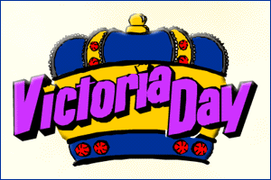
Answer: The name of my holiday is Victoria Day.
2. When will the holiday be celebrated in 2011?
Answer: The holiday will be celebrated on Monday, May 23 of 2011.
3. Who celebrates this holiday? (Countries, religious groups, ethnic groups)
Answer: The people who are celebrated this holiday is the Canadian people. Basically Canada celebrate Victoria Day.
4. Why is this holiday celebrated? What is the significance of this holiday?
Answer: This holiday is celebrated because of the honor they had towards queen Victoria and the Sovereign. The significance of this holiday is that Canada still a member of the Commonwealth of Nations like Queen Victoria was back then. Queen Victoria was honor the longest ruling Queen and followed the monarchy leading British to success.
5. How is this holiday celebrated? Include any rituals, food, costumes, dance or music associated with this holiday.
Answer: This holiday is celebrated by having no school, having a day off and having a lot of amusement as well as fireworks.
6. What websites were used in answering these questions? (Copy and paste the web addresses of each website.)
Answer: http://www.knowswhy.com/why-is-victoria-day-celebrated/
http://www.knowswhy.com/why-is-victoria-day-celebrated/
http://www.knowswhy.com/why-is-victoria-day-celebrated/
Friday, December 10, 2010
Blog Entry # 2.6 - Process Journal 1 (C)
The steps that I need to do to create this greeting card are
- creativity
- pictures
- research
- how I'm going to do design my greeting card
The material and resource I would use the computer, Internet, analysing other company greeting cards and the amount time needed for each of the greeting card is about 1 hour.
Blog Entry # 2.5 - Design Brief (A)
I am going to design and make a greeting card for three different people. One might be for kids and the other one can be for sports as well as people who like fashion or just for teens. The goal for this project is to make Victoria greeting cards for these three people. Kids, teens and people who like to play sports are my target audience.One important element that I think is important for a successful product is creativity and the message that the card have in its image.Lack of creativity is one of the thing I don't want to see in my design as well as misspelling.
Blog Entry # 2.4 - Product Analysis 3 (A)

1. What holiday/event does the card represent?
The holiday/event that this card represent is Christmas.
2. What type of images are used – photos, cartoons or graphics? How do the images used connect to the holiday/event?
The type of image use in this card is graphics. The image is use as a soft and gentle way as well as it represent a gift meaning that a child is the best and adorable part of Christmas.
3. In your opinion, is the cover of the card attention-grabbing? Explain exactly why or why not. Consider the arrangement of elements as well as use of images, color and text.
The cover of the card is attention-grabbing because it has an adorable image of babies dress like reindeer's and the middle baby have a red nose.
4. What text is written on the front of the card? Where is it located on the front?
"Anne Geddes" is written on the bottom of the card.
5. What text is written inside the card? Where is it located inside the card?
"Peaceful wishes for a holiday season fill with dream come true." It is located in the front where you can see it, whenever you open the card.
6. In your opinion, does the text inside the card connect to the image(s) on the cover? Explain exactly why or why not.
The text inside the card relates to the image because a child have a dream and they are the prize possession of a mother and father.
7. What types of information appears on the back of the card? (Do not copy it exactly!)
The types of information that appears on the back of the card is a bar code and the company name.
8. To what consumer is this card targeted? (Consider age group, gender, race and/or religion.) What about the design led you to this conclusion?
The consumer that this card targeted is a mom that is sending it to their child. The image led me to this conclusion because the mother prize possession is their child and they want their child to know that they love them.
Blog Entry#2.3-Product Analysis 2 (A)
1. What holiday/event does the card represent?
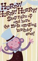
The Holiday/event this card represent is a birthday.
2. What type of images are used – photos, cartoons or graphics? How do the images used connect to the holiday/event?
The type of image use in this photo is cartoon because it look like someone drew it and just added shine to make the card pop out. This image connect to the holiday because the monkey is an exciting animal and its happy for your birthday.
3. In your opinion, is the cover of the card attention-grabbing? Explain exactly why or why not. Consider the arrangement of elements as well as use of images, color and text.
3. In your opinion, is the cover of the card attention-grabbing? Explain exactly why or why not. Consider the arrangement of elements as well as use of images, color and text.
The cover of the card is attention grabbing because it has shimmer and its bright. This card have a good cover and have a bright pink text.
4. What text is written on the front of the card? Where is it located on the front?
"Hurry!Hurry!Hurry!step right up and have the most amazing birthday ever" and it is located on the top.
5. What text is written inside the card? Where is it located inside the card?
"Today you're at the center of attention-right where you belong! Happy Birthday" and it is located in the front where you can see it, whenever you open the card.
6. In your opinion, does the text inside the card connect to the image(s) on the cover? Explain exactly why or why not.
The text inside the card have a good connection to the image in the cover because the monkey is center of attention and the cover has a bright pink text that show how special the person is in the front of the card and the back of the card.
7. What types of information appears on the back of the card? (Do not copy it exactly!)
The type of information that appear on the back of the card is the company, where the card was made and the broad price.
8. To what consumer is this card targeted? (Consider age group, gender, race and/or religion.) What about the design led you to this conclusion?
The consumer that this card is targeted is a little girls or girls because the text is shimmer pink and the cover looks more like a girl card and since it has monkey it would be targeted little girls birthday.
Blog Entry#2.2-Product Analysis (A)

1. What holiday/event does the card represent?
The holiday/event that the card represent is Thanksgiving.
2. What type of images are used – photos, cartoons or graphics? How do the images used connect to the holiday/event?
The type of image that is used in this photo is cartoon. This image have a connection to the holiday/event because it have a turkey and two people who are sailing acroos sea. It looks like two people are join together to eat and celebrate with each other.
3. In your opinion, is the cover of the card attention-grabbing? Explain exactly why or why not. Consider the arrangement of elements as well as use of images, color and text.
The cover of the card is not attention-grabbing because it looks ugly to me and wouldn't send this card to someone I care about. This card does not have a good text because it doesn't look nice with the image. The color is too plain it should be more creative and have more bright color.
4. What text is written on the front of the card? Where is it located on the front?
The text that is written in the front of the card "Thanksgiving is here again..." and it is located on the top .
5. What text is written inside the card? Where is it located inside the card?
"Wish you were, too! Hope you have a Happy Day" is written inside of the card. It is located in the front of the card so when you open it you can see it.
6. In your opinion, does the text inside the card connect to the image(s) on the cover? Explain exactly why or why not.
The text inside the card connects with the images on the front because the person that their sending this card to is not with them right now and it basically means that he or she misses that person who they care so much about.
7. What types of information appears on the back of the card? (Do not copy it exactly!)
The types of information that appears on the back of the card is the bar code, and the company that made the card as well as were it was made.
8. To what consumer is this card targeted? (Consider age group, gender, race and/or religion.) What about the design led you to this conclusion?
This card is targeted a person who can't be with their family members such as childern who miss their relatives. The text led me to this conculsion because it said "wish you were too!"
Blog Entry #2.1-Design Task (A)
The design task that I was assign was making a greeting card for three different people. The holiday greeting card that I was assign is victoria day.
Saturday, December 4, 2010
Blog Entry # 1.15 - Human Ingenuity Evaluation (E)
Each of these group will react in different ways such parents, visitors and teachers are looking for creativity as well as hard work. They are also looking for the connection my picture haves with the titles. The students are going to react with excitement because they see their classmate in the poster. They also going to look for creativity. The message each group will receive is how the definition relates to the title and how the picture relate to the title as well as definition. Once they see these connection they would realize the true meaning of the titles in each posters and how TMA students demonstrates it. It also show what each IB learner profile means to us.
Blog Entry # 1.14 - Attitudes Evaluation (E)
The learner profile BALANCED was my greatest strength because I work hard on it and I added my own creativity to this poster as well as the picture looks good in this poster. The learner profile INQUIRE was my biggest challenge because it was hard to find a front and to find a picture that represent this poster. I work to the best of my ability because I try to make the poster come alive and I try to find the prefect color as well as image that can relate to the title and the definition.
Blog Entry # 1.13 - Create Evaluation (E)
One problem I encounter I was trying to be creative with my poster. I fix this problem by highlighted the title of balance with green. One new technology skill I learned during this project was highlighted my front and coloring the front with one color. I would use this skill in my English class because we somewhat design poster all we might use PowerPoint. I would also use it again in technology in case we are dealing with adobe illustrator.
Friday, December 3, 2010
Blog Entry # 1.12 - Investigate Design/Plan (E)
One change that was made in my final posters was background color and front color because in my sketches I had different front color and background color. I couldn't use rainbow as my background color because too many colors are destructed and I couldn't use my original front color because I needed the front color to match with the background color. there were changes but I think I handle it well.
Blog Entry # 1.11 - Investigate Evaluation (E)
I added some ideas from the other posters (successories) into my own poster by using black as my front color not my background color. I also use big letters for my titles just like the other poster and i added times new roman as my front. However, I added my own style to all of my posters. Basically I had more of my own design and I use a little to the successories posters.
Blog Entry # 1.10 - Product Evaluation (E)
I can improve my project design by adding different front and trying to add two color and not one color because I want my poster to come out nice and not too plain. Another way I can improve my poster is trying add more pictures that matches the color of the poster, as well as coloring the front.
Blog Entry # 1.8 - Final design (D)
The front I use is new york time and script because the front went with my poster and we didn't had enough time to work on it plus I'm looking for a good looking front that everyone can read.
The "Balanced" poster was the best design because I added more color and the picture looks great. My layout choice was finding color for all of my poster and trying to make my poster come alive with the picture. I will create these poster by trying add color ans a front that look nice and it's easy to read.
The "Balanced" poster was the best design because I added more color and the picture looks great. My layout choice was finding color for all of my poster and trying to make my poster come alive with the picture. I will create these poster by trying add color ans a front that look nice and it's easy to read.
Sunday, September 26, 2010
Blog Entry # 1.7- Design Specification
1. what is begin made is an IB learner profile that have the meaning of the words and a picture about the words.
2.The poster is for the school and the students of TMA to see and its purpose is to tell everyone that TMA is an IB school that teaches students how to be an IB learner.
3. The poster is for the visitors such as parents and the students. The audience is the teacher and the lower grade students so they can know that this is an IB school and that we know what the IB learner profile is all about.
4. The size equipment is a 8 by 10 construction paper or just a camera and the computer so we can post it in our blog.
5. The design elements required is creativity and group work as well as all of the requirement needed for the poster.
6. The aesthetics is the assignment at hand. It should look like the poster in tmatechblogspot.com and the teacher specific instruction.
7. The materials and equipment is needed is a camera and a laptop/ computer.
Saturday, September 25, 2010
Blog Entry # 1.6 - Design Brief (A)
I am going to design and make a voting policy because sometime my groups will argue about how they want their poster to look like, and taking a vote will break up that argument so we could continue to work on the rest of the IB learner profile.Taking a vote would make us continue working on the other IB learner profiles and not waste time in one IB learner profile.
The design would basically help me and my group make correct decision of what were going to write, how were going to take pictures and not wasting time in one subject. I have been told that a majority vote will end with discussion of the type of thing we want to make or solve.
This method is rough but also easy and it would function for a group of people working on something.
Blog Entry # 1.5 - Areas of Interaction (A)
What are the Areas Of Interaction that have been highlighted by your teacher for this design task?
The areas of interaction that have been highlighted by my teacher was approcahing to learning and human ingenuity. Each of the areas of interaction are related to the project by learning what all of the IB learner profile is all about, and experiences it by publishing the poster, and connecting what we wrote about the picture to the meaning of one of the IB words.
The areas of interaction that have been highlighted by my teacher was approcahing to learning and human ingenuity. Each of the areas of interaction are related to the project by learning what all of the IB learner profile is all about, and experiences it by publishing the poster, and connecting what we wrote about the picture to the meaning of one of the IB words.
Friday, September 24, 2010
Blog Entry # 1.4 - Design Task (A)
Explain in your own words the design task that you have been ask to solve?
The design task that I have been ask to solve is how to make a poster with all of the IB learner profile, as well as how to work with a group. The task is also about how to construct a poster were everyone can pith in ideas and use them to take good picture that reflects the title of the poster. We should also think about how the poster we like including the font that we saw in tmatech.blogspot.com and how we can use them for my poster.
The design task that I have been ask to solve is how to make a poster with all of the IB learner profile, as well as how to work with a group. The task is also about how to construct a poster were everyone can pith in ideas and use them to take good picture that reflects the title of the poster. We should also think about how the poster we like including the font that we saw in tmatech.blogspot.com and how we can use them for my poster.
Blog Entry # 1.3 Poster Analysis 3 (A)
 1. The main image of the poster is caring and I don't like the picture.
 2. The image use in the poster does not represent caring at all to me.
3. The color used for the background of the font is ugly because it ruined the image of the picture.
4. The words do mean what caring is all about and it is located in the bottom of the picture and above the picture.
5. The font to me is nice and it is the only thing I like about the picture because it clear white.
Blog Entry # 1.2 Poster Analysis 2 (A)

1. The main image use in this poster is how a person can be open minded by learning and understanding other people culture.
2. the image use in the poster effectively communicate what the poster is about by showing how much she love learning about other country.
3. The color is blue and the font is bold black and I think is a bad choice of color because it doesn't macth the picture.
4. The words are located in the left hand corner and the title above the picture.The words explain everything about being open minded.
5. My opinion about the font is bold which is good because I like people to see it plus its a normal font for everyone to read.
Blog Entry 1.1 poster analysis 1 (a)
 1. The main image use in this poster is the achievement of excellence that is created by a person who constructed something new and didn't give up.
2. the image use in this poster does communicate the point of the poster because it explain hard work and dedication towards something you reach, build or construct.
3.The color is blue and a silver yellow and the front is big for everyone to see. I think it is a good color to use because blue represents reaching for the sky and the silver yellow represents reaching for the stars.
4. The words explain what the poster and the picture is about. The words are located in the bottom of the poster because it show how the words and the picture is connected.
5. The font is OK because it is written in a big font were everyone can see it and understand why the poster is called excellence.
Subscribe to:
Posts (Atom)